

Cairngorms Winter Companion App
Date: 2025
Duration: 8 weeks
Role: UX/UI Designer
Project type: Case study
A mobile companion app for the Cairngorms that delivers a centralised end-to-end experience for people planning and navigating their visit on the slopes
The Cairngorms Winter Companion app was designed to provide visitors to the snow slopes at the Cairngorm Mountains with a dedicated, mobile-first platform that supports both trip planning and on-slope navigation. Inspired by gaps identified in existing ski utility apps and the resort’s current digital experience, the project aimed to create a more cohesive and interactive solution that combines practical features such as ticket booking, equipment hire, live slope conditions, and interactive mapping with social and community-driven functionality.
Background
Existing ski and winter resort applications often attempt to support multiple locations and features within a single platform, resulting in experiences that can feel cluttered, inconsistent, and lacking in resort-specific functionality. Cairngorm Mountain is a well-known Scottish destination for skiing and snowboarding, attracting visitors throughout the winter season. However, important information such as slope conditions, navigation, and booking services is currently fragmented across websites and static resources, making it difficult for users to quickly access the information they need before and during their visit.
This presented an opportunity to design a dedicated mobile experience centred around Cairngorm Mountain that combines utility, live information, and social features within a single platform to create a more seamless and engaging visitor experience.


Research
I explored existing ski slope related mobile apps to understand the utility they provide, referenced the Cairngorms' existing online experience on their website, and interviewed individuals who regularly visit the Cairngorms to use the snow slopes in winter.
Competitive Analysis
Analysing competitor ski and resort apps helped identify common features, usability patterns, and gaps within the current market. This research provided insight into how other platforms approach navigation, live conditions, mapping, and booking experiences, while also highlighting opportunities to improve the mobile experience specifically for Cairngorm visitors

To better understand user expectations and identify opportunities within the ski resort app market, I analysed seven existing ski and snow sport applications:
-
Slopes
-
Skiline
-
SkiTracker
-
OnTheSnow
-
SkiiL
-
Skiresort.info
-
weSki
The analysis focused on identifying common functionality, recurring usability patterns, and opportunities for improvement within the mobile ski experience.
Key Insights
Competitor analysis showed that activity tracking and slope statistics are now standard features across modern ski apps. The research also highlighted a growing focus on interactive navigation and social features, while revealing that many platforms still separate resort information, bookings, and navigation into fragmented experiences, creating an opportunity for a more unified mobile-first solution.
The Current Experience


I analysed the existing Cairngorm Mountain website to evaluate the current user experience, identifying key strengths, weaknesses, opportunities, and potential threats within the platform.
Strengths
-
Up-to-date, relevant information
-
Offers condition monitoring and forecasting (live webcam, mountain report)
-
Established and trusted resort brand
Weaknesses
-
Uses separate websites for info and purchasing passes/rental equipment
-
Piste Map is a static image
-
Mobile view is distorted if a page has a large table on it (can zoom outwith mobile proportions)
Opportunities
-
Centralise mountain information, navigation, and purchasing into a single mobile app
-
Introduce an interactive GPS-enabled piste map
-
Improve accessibility with larger touch targets and glove-friendly interactions
-
Introduce social/community features such as friend tracking or leaderboards.
Threats
-
Large volumes of information may become difficult to prioritise on smaller screens
- Users wearing gloves may struggle with precise touch interactions
- Poor mountain signal or limited connectivity could affect usability
- Increased battery drain due to cold conditions
While the existing Cairngorm experience provides valuable and accurate information, the platform prioritises information availability over usability in-context. Visitors on the mountain often need fast, glanceable interactions in challenging environmental conditions, creating an opportunity for a more focused mobile-first experience.
Due to the project being a self-initiated conceptual case study, formal user interviews were not conducted on this project. Instead, research focused on competitor analysis, heuristic evaluation, and identifying contextual challenges associated with on-slope mobile usage.


Define
To ensure my design was grounded in the needs of the potential customer, a user persona was created based on key insights from my research.

How can we....
Create a mobile-first ski resort experience that allows visitors to quickly access live conditions, navigation, bookings, and activity tracking in a way that remains intuitive and usable in challenging on-slope environments?


Ideation
The interactive map became the core focus of the ideation phase as it directly solves the challenge of helping users navigate a ski resort quickly and efficiently in a fast-paced environment like being on the slopes. Unlike static maps or text-heavy interfaces, it allows users to understand routes, check slope conditions, and make informed decisions at a glance, reducing cognitive load in time-sensitive situations.
By layering information such as slope difficulty, live conditions, and user signals, the map acts as both a navigation tool and real-time decision-making aid, improving usability and supporting safety.
To create a complete end-to-end experience, the app also includes pass purchasing, equipment hire, and live resort updates like snow depth, temperature, and weather. This centralises the visitor journey into one platform, reducing friction and helping users prepare and adapt faster.
A darker, high-contrast colour palette with high contrast was also chosen to improve visibility in bright outdoor conditions while supporting battery efficiency on OLED and AMOLED devices, where dark interfaces consume less power.
To align my solution with user needs, I first created a sitemap to ensure seamless navigation.

Next, I designed user flows so I could better understand the necessary steps and pages users will embark on within the app. The key was to maintain simplicity with navigation, offering straightforward means of buying tickets, hiring equipment, or utilising map features. As a result, a user flow was made for using the map, and another for buying a Lift Pass and hiring Equipment:


Having decided on creating an interactive map for this project, and having already seen what the map experiences are like on existing ski apps, I made sure to research popular map apps to see how they delivered their experiences.
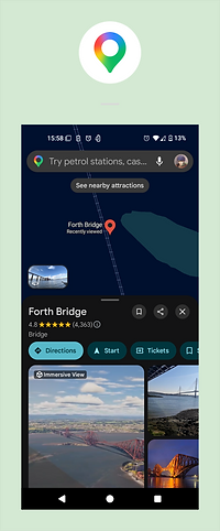
Google Maps, Yandex Maps & Navigator are both increadibly popular map apps on the market, with 10 billion and 100 million downloads respectively. I noted the following key features:
Both apps make use of bottom sheets to display information about a point of interest. This can be expanded upwards into a full view for a more comfortable means of viewing further detail, or dragged down for a minimised view that only shows the bare minimum info, such as the location name.
A number of existing Ski apps previously researched also make use of bottom cards or a similar method to display information alongside the map. However, most of them could be improved in terms of accessibility, as I noted important CTA's or text were too small, especially for the purpose of this app in challenging slope environments.


Design
With the app structure defined, I created wireframes of key pages to ensure a smooth and intuitive experience for users planning their ski trips. Prioritising ease of use, accessibility, and practical trip-planning, I then refined my designs into high-fidelity screens, focusing on:
-
Clear, digestible content that shows essential information such as weather, slope conditions, and mountain updates
-
Large, accessible buttons and interactive elements for quick, reliable use in outdoor conditions
-
Intuitive navigation and map interactions that make wayfinding simple and efficient on the mountain
Home menu
The focus of this part of the app was to give users the most necessary information about the status of the slopes. This would help them plan and prepare for their trip, but also serves as a quick point of reference to check conditions. A summary of the current weather, temperature, wind speed, and snow height at higher and lower elevations were consistent points of info found on competitor apps.

Map
The map is the app’s core feature, helping visitors navigate slopes, meet with friends, and stay engaged through competition.
To improve usability, slopes and lifts use thicker lines for easier interaction while wearing gloves. Selected routes are highlighted, while the rest of the map is desaturated for clarity. Bottom cards help manage screen space efficiently, balancing navigation and information while supporting accessibility-focused design.
The app also provides live slope and lift statuses, including maintenance and closure updates, giving visitors quick access to essential information that would otherwise rely on social media or on-site notices.


Lift Passes and Equipment hire purchasing
I referenced the existing booking flow on the Cairngorm Mountain website and adapted it for a smoother mobile experience. Keeping all age categories on one screen allows users to book for their full party at once, avoiding repetitive steps. To optimise mobile space, each age category is placed in an expandable drawer.
User inputs use native interactions such as date pickers and dropdowns for familiarity and ease of use. Equipment hire is also linked to any pass already in the basket, automatically matching dates to reduce user error.


Visual identity
A dark blue colour palette was chosen to reflect the cold, alpine environment while reinforcing a sense of trust and reliability. The darker tones improve contrast and readability in bright snowy conditions, while allowing important status colours such as green, amber, and red to stand out clearly for quicker decision-making.
Font: Lato and Gadugi was selected for its clarity, but with a subtle roundness to reflect the softness of snow.
UI Components: Subtle rounded corners paired with a strong, defined contrast creating approachable and tactile elements that are easy to interact with.
A highly configurable design system was developed to ensure a more smoth development, while also offering the flexibility to accommodate the different types of information that ski slopes can provide to users.

Results
The completed Cairngorms Winter Companion app delivers a more connected and accessible experience for visitors by addressing key gaps in the existing journey. By introducing an interactive map and a centralised, end-to-end system for purchasing passes and hiring equipment, the app streamlines the planning process and reduces friction for users. Insights gathered through competitor analysis helped shape familiar and intuitive features, while maintaining focus on the needs of the target persona, particularly around accessibility and clear navigation. The final product provides a comprehensive mobile experience tailored to the facilities and visitor needs of Cairngorm Mountain.

Final thoughts
What I learned:
-
Learned to carry out effective research and competitor analysis by keeping the needs of the user and the problem they face at the forefront of the design
-
Adaptation of existing content, experiences, and flows into a mobile experience, and improving upon them to better fit that experience.
-
Designing for environmental usability, taking into account accessibility concerns throughout the design process and ensuring interactive elements were sensibly sized for real-world use.
-
Maps are hard: Creating the interactive map was one of the most challenging parts of the project. I manually edited the Cairngorm Mountain Piste Map in Photoshop to adapt it into a usable mobile interface. Translating a static map into a usable experience for mobile taught me the complexity of map-based design and strengthened my problem-solving skills.
Next Steps:
User testing would be necessary to fully understand how effective this solution is for visitors on the Cairngorm Mountain slopes. Though the app is primarily a dark colour palette, I would also like to explore a light mode colour scheme. Admittedly, this would change a lot of the colouring on the map screen in particular, as contrast would need to be tweaked for the lanes against a white background.
What I’m proud of:
The interactive map was the most challenging part of the prototype, and I’m proud of how close it feels to a final product. I challenged myself to make the bottom cards work alongside the map rather than relying on separate screen states, creating a more realistic and seamless experience. Although it was time-consuming, I learned how layered interactions can make a prototype feel much closer to a live product, and how much planning that requires. Ultimately, it has strengthened my prototyping skills and better prepared me for future projects.